Tutorial Files
Before we start, you may want to download the sample data (.csv) used in this tutorial. Be sure to right-click and save the file to your R working directory. This dataset contains pre and post test scores for 66 subjects on a series of reading comprehension tests (Moore & McCabe, 1989). Note that all code samples in this tutorial assume that this data has already been read into an R variable and has been attached.Plotting Two Variables
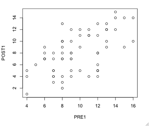
The simplest way to create a scatterplot is to directly graph two variables using the default settings. In R, this can be accomplished with the plot(XVAR, YVAR) function, where XVAR is the variable to plot along the x-axis and YVAR is the variable to plot along the y-axis. Suppose that we want to get a picture of the relationship between pretest 1 (PRE1) and posttest 1 (POST1). The following example demonstrates how to use the plot(XVAR, YVAR) function to visualize this relationship.The output of the preceding function is pictured below.
- #create a scatterplot of Y on X using plot(XVAR, YVAR)
- #what does the relationship between pretest 1 and posttest 1 look like?
- plot(PRE1, POST1)
Plotting All Variables
When beginning to analyze a dataset, researchers often want to get a complete picture of all relationships, rather than just a single one. Conveniently, the plot() function can also be run on an entire set of data. The format for this operation is plot(DATAVAR), where DATAVAR is the name of the R variable containing the data. Suppose now that our interest is in visualizing all of the scatterplots at once, in order to diagnose the various relationships present in our data. The following example demonstrates how to use the plot(DATAVAR) function.The output of the preceding function is pictured below.
- #create scatterplots of all variables using plot(DATAVAR)
- #what do all of the relationships in the data look like?
- plot(datavar)

Note that the image above has been resized to fit on this page. In the R Quartz Window, the scatterplots could be made much larger for easier viewing.
Custom Plotting
Additional Plot() Arguments
Up to this point, we have been using the default values for all of our scatterplots' elements. However, R also allows for the customization of scatterplots. In addition to x and y axis variables, the plot() function also accepts the following arguments ("The Default Scatterplot Function", n.d.).- main: the title for the plot (displayed at the top)
- sub: the subtitle for the plot (displayed at the bottom)
- xlim: the x-axis scale; uses the format c(min, max); automatically determined by default
- ylim: the y-axis scale; uses the format c(min, max); automatically determined by default
- xlab: the x-axis title
- ylab: the y-axis title
- Even more arguments are accepted by the plot() function. Take a look at the referenced page if you wish to explore further options.
The output of the preceding function is pictured below.
- #create a detailed scatterplot of Y on X incorporating the optional arguments of the plot() function
- #set axis scales for x and y to range between 0 and 20
- #set main title and subtitle
- #set x and y axis labels
- plot(PRE1, POST1, xlim = c(0, 20), ylim = c(0, 20), main = "Posttest 1 on Pretest 1", sub = "A Scattered Tale", xlab = "Pretest 1 Score", ylab = "Posttest 1 Score")

Advanced Plotting
There are numerous graphical arguments available to functions in R. In this tutorial, just a few of the common aesthetic options will be addressed below ("Set or Query Graphical Parameters", n.d.).- col: determines the colors used for points and lines; accepts character strings of color names (i.e. "red", "green", etc.)
- pch: the type of point to use (i.e. circle, square, triangle, etc.); accepts values 0-25 for symbols and 32-255 for characters
- cex: the amount to scale the size of points; accepts a numeric value; default is 1
- lty: defines the line type; accepts various character strings (i.e. "solid", "dashed", "dotted", etc.)
- lwd: defines the line width; accepts a positive number; default is 1
Now let's recreate the plot of posttest 1 on pretest 1 yet again, but this time with the inclusion of customized aesthetic parameters.
The output of the preceding function is pictured below.
- #create a scatterplot of Y on X incorporating the custom aesthetic parameters of the plot() function
- #set point colors to dark green, red, and orange
- #set point markers to circle, square, and diamond
- #set point size to three times the default
- #set lines to be solid and three times the default thickness
- plot(PRE1, POST1, xlim = c(0, 20), ylim = c(0, 20), main = "Posttest 1 on Pretest 1", sub = "A Scattered Tale", xlab = "Pretest 1 Score", ylab = "Posttest 1 Score", col = c("dark green", "red", "orange"), pch = c(21, 22, 23), cex = 3, lty = "solid", lwd = 3)

Note that the c() function is used for a number of the parameters in the plot function above. This allows one to define multiple values as a "vector" that can be fed into a single argument. For example, if one wanted to use only a single line color, then col = "red" would be acceptable. However, to use multiple colors, all items must be placed into a vector such as col = c("red", "green", "blue"). Without using a vector for multiple colors, as in col = "red", "green", "blue", an error would occur because the colors would be treated as separate arguments rather than a single entity.
Complete Plot Examples
To see a complete example of how scatterplots can be created in R, please download the plot examples (.txt) file.Even More Visualizations
R has much more sophisticated graphic capabilities than have been demonstrated in this tutorial. In fact, opportunities exist to make very complex and unique visuals. To see examples of the kinds of charts that can be generated with R, I recommend that you visit the R Graph Gallery (François, 2006).References
François, R. (2006). R graph gallery: Enhance your data visualization with R. Retrieved November 11, 2009 from http://addictedtor.free.fr/graphiquesMoore, D., and McCabe, G. (1989). Introduction to the practice of statistics [Data File]. Retrieved October 27, 2009 from http://lib.stat.cmu.edu/DASL/Datafiles/ReadingTestScores.html
Set or Query Graphical Parameters. (n.d.). Retrieved November 11, 2009 from http://sekhon.berkeley.edu/graphics/html/par.html
The Default Scatterplot Function. (n.d.). Retrieved November 11, 2009 from http://sekhon.berkeley.edu/graphics/html/plotdefault.html
For some reason the it doesn't recognize the object PRE1 in the second example, why may that be?
ReplyDeleteHi Dane,
ReplyDeleteIt is hard to tell without seeing it, but maybe the dataset is not attached. Could you please provide the error message that you received?
I'm a bit confused by the colour coded scatter plot example here. I would have thought colours would be assigned according to a catagorical variable (ie "Group" in this case), but it seems that the colours here are assigned randomly to data points? Could you perhaps post an example of how to assign colours based on a third variable? I think this would have far more practical application.... thanks!
ReplyDeleteFor group based coding of col, just type the following as part of the call to plot() function:
ReplyDeletecol=as.numeric(groupvariable)
How this works is....
Groupvariable is converted to a numeric (starting from 1) and color is selected as per group level
If you want specific colors, then for a groupvariable with three levels, add argument:
col= c("red", "green", "blue")[as.numeric(groupvariable)]
This should do.
Hi Heretic,
ReplyDeleteThanks for posting this tip.
Thank you so much for posting all of this!!! I'm re-learning R and it's super helpful. I wish I'd had this as a reference when I was learning it the first time...
ReplyDeleteHi Aly,
ReplyDeleteI'm glad that the tutorials are helpful for you.
Hi,
ReplyDeleteIs there a way not only to assign colors to specific points, but to label them, e.g. by an ID variable (like 1,2,3... or A,B,C...) ?
thanks.
Hi Daniel,
ReplyDeleteSee Labeling Data Points link in the Data Visualization menu on the right-hand side of the page.
John
col=c("red", "green")[as.numeric(matrix$type)]
ReplyDeletewhere type is a column in a matrix with value of 0 or 1 does not lead to a scatterplot with red points for type=0 and green points for type is 1.
Confused!
See Heretic's and others' comments above for coloring points by group.
ReplyDeleteHi John, I tried that, but
ReplyDeletecol=c("red", "green")[as.numeric(matrix$type)]
seems to only show a red color for all data points and not the green color at all.
I found a solution that works. using if-else. But it probably wont work if you have more than 2 groups.
col=ifelse(matrix$type == "0", "red", "green")
I think using a grouping variable would help in the format that Heretic explains. The grouping variable would be the column in your dataset that identifies which group each object belongs to. For example, with students you might have freshman, sophomore, junior, and senoir in your "class" grouping variable. Since each student in your dataset has a class, R could use this information to plot a color for each student that matches his/her class.
ReplyDeleteJohn
Hi John,
ReplyDeleteThanks for the awesome tutorial!
One question: How do I include a legend on the graph?
Hi Jonathan, take a look at the help documentation for the legend() function, which adds a legend to a plot. John
DeleteThank you!
DeleteHello, Thanks for the tutorial.How can I removed the plot borders and maintain only the x and y axes? I have tried the function frame.front but it does not work. x and y appear separately. Please help me.
ReplyDeleteHi
ReplyDeleteI have two questions
1) How do I change the color of the background of plots ?
2) More precisely how can we paste an image as background picture of a plot ?
I mean I have gps coordinates, and I plot them (y axis=lat, and x axis=long).
I thus get a scattered point pattern on a 500x500m white scatterplot.
I want the background to be the google earth image of the landscape on which the gps coords were recorded and not the default.
I was thinking that if we can make the background of the plot transparent then I can superpose the images, if well georeferenced
Any script for this ? any ideas ?
Did you get answer for question 2 .. I was also looking to do the same ..many thanks
DeleteHi John - what do you suggest when you have a large x-axis range e.g. 0-1,000,000 and the values come up as e+06? What is available to adjust this without collapsing the range using xlim?
ReplyDeleteThanks
Hi John,
ReplyDeleteIf you've used the different symbols/colours for groups in a scatterplot how do you show what they are in the legend?